How Neural Networks Learn to See
Projecting activations from every layer of a CNN trained on FashionMNIST. Watching representations go from noise to clean clusters.
A neural network trained on FashionMNIST reaches ~90% accuracy in under a minute. But that number tells you nothing about what the network actually learned. It doesn’t tell you how layer 1 sees the world differently from layer 6, or why the model confuses shirts with coats but never confuses shirts with bags.
I wanted to look inside the network, literally. So I built a tool that hooks into every layer of a CNN, extracts activations for thousands of test images, projects them to 2D with UMAP, and lays the results side by side.
The setup
A small CNN. Two convolutional layers, two fully connected layers, ReLU activations, max pooling. Nothing unusual. The dataset is FashionMNIST: 10 categories of clothing items rendered as 28x28 grayscale images.
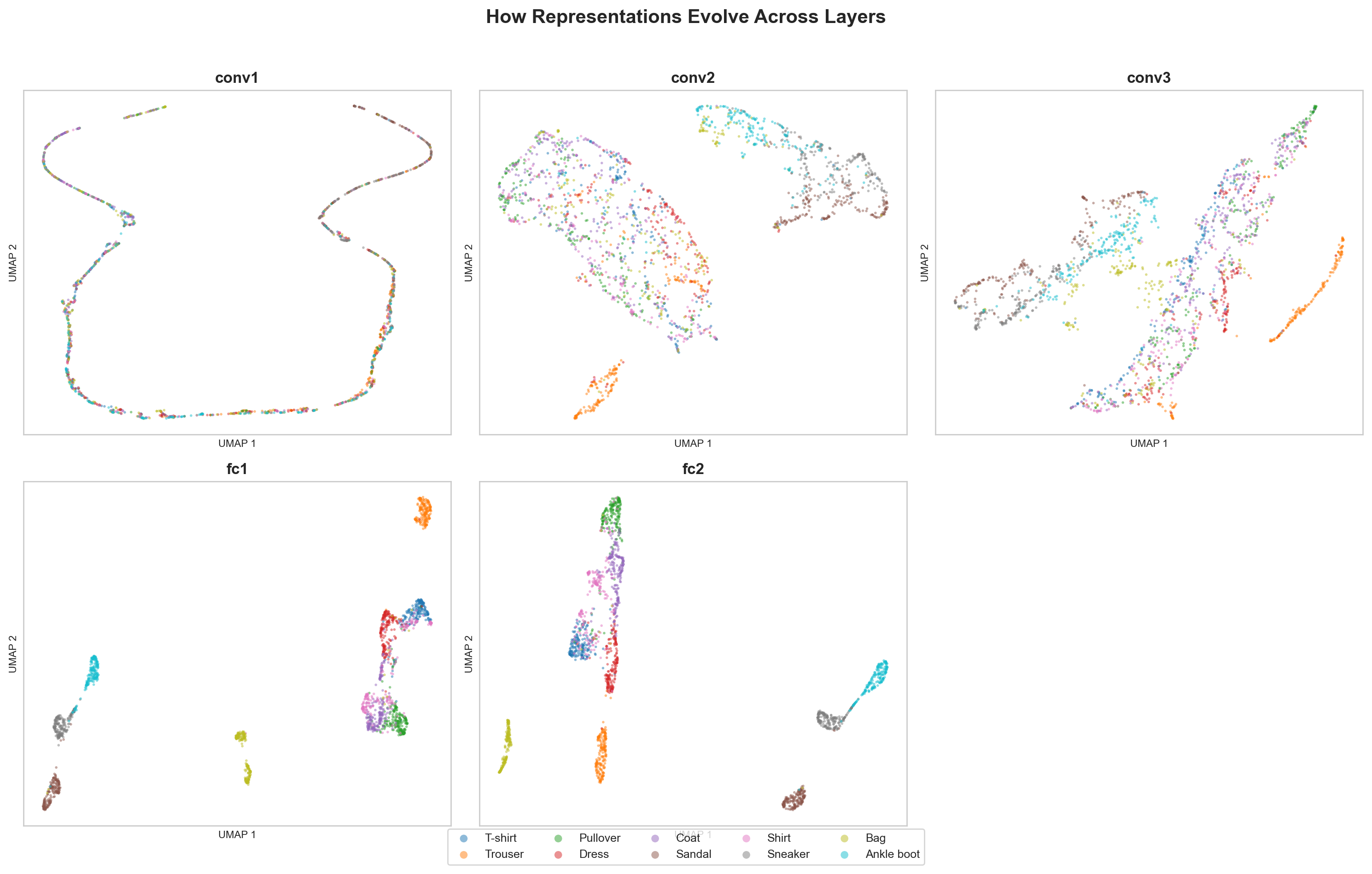
Using PyTorch forward hooks, the pipeline captures activations at every layer for 5,000 test images. Each activation tensor gets flattened and projected to 2D using UMAP (for structure-preserving visualization) and PCA (for variance analysis). The result is a grid of scatter plots, one per layer, where each point is an image and each color is a class.
What the projections reveal
The first convolutional layer is a mess. All ten classes sit on top of each other in a single diffuse cloud. The network has barely transformed the input. Pixels went through a few 3x3 filters, but the resulting representations carry almost no class-discriminative information.
By the second conv layer, you start to see hints of structure. Footwear (sneakers, sandals, ankle boots) drifts away from upper-body clothing (shirts, coats, pullovers). The network has started grouping things by coarse visual similarity, not because it was told to, but because the classification loss pushes representations apart.
The first fully connected layer is shows clear structure. Clusters become visible. Trousers separate cleanly. Bags form their own island. But the confusable categories, T-shirts and shirts, pullovers and coats, still overlap significantly. These items genuinely look alike in 28x28 grayscale. The network is still working on telling them apart.
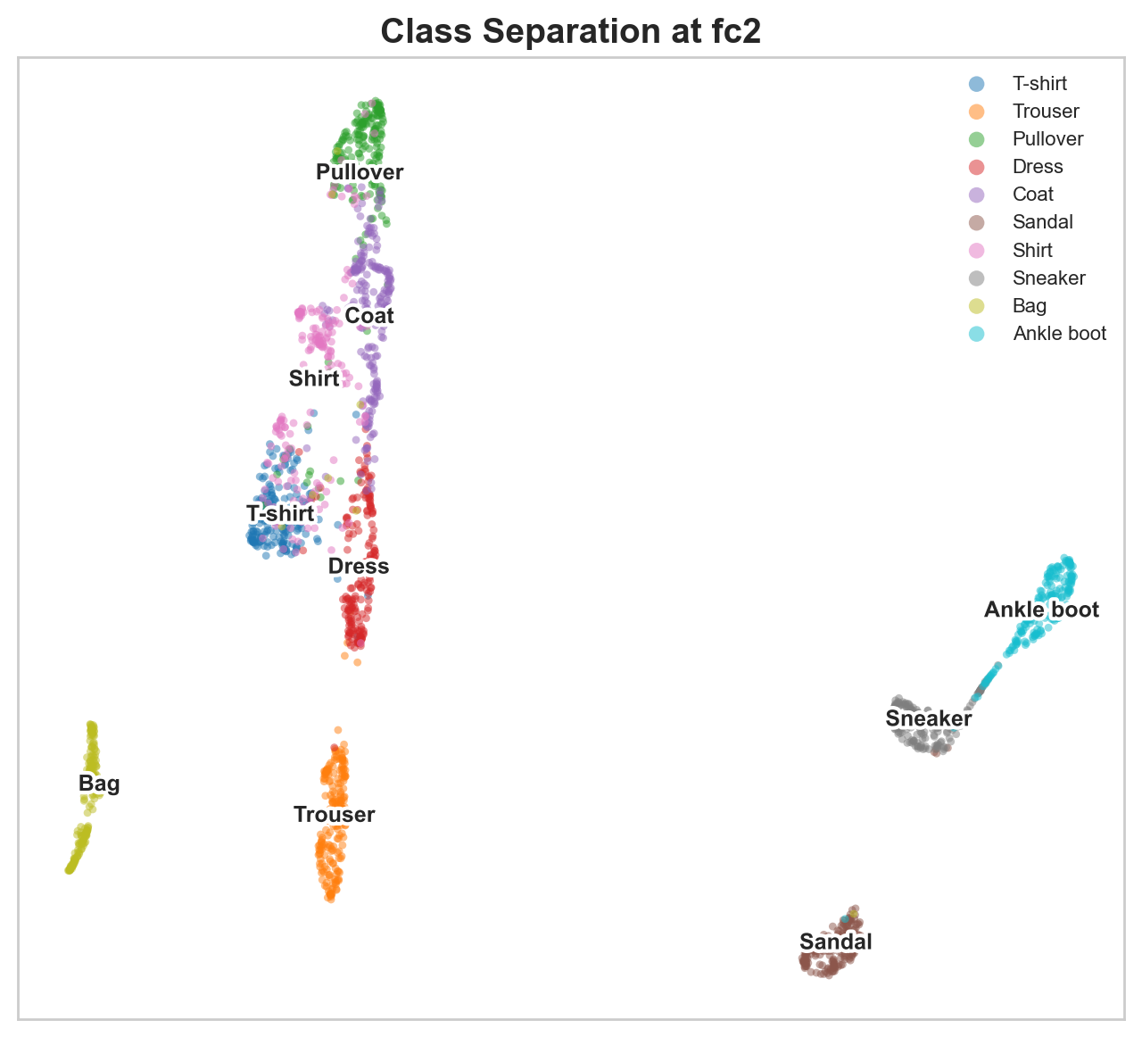
The final FC layer, right before the classification head, is striking. Ten tight clusters, mostly separated. The network has organized 784 raw pixel values into a compact space where each class occupies its own region. This is the representation the classifier actually uses to make predictions, and you can see why it works.
PCA tells the same story differently
UMAP preserves local structure but can distort global relationships. PCA gives a complementary view through explained variance curves.
At early layers, variance is spread across many principal components. The first 10 components might explain only 40% of total variance. Information is distributed. No single direction in activation space captures a useful signal.
At later layers, variance concentrates. The first 2-3 components explain the majority of variance. The network has learned a low-dimensional code, compressing the information that matters for classification into a handful of directions and discarding the rest.
This compression is not an accident. It is what the cross-entropy loss optimizes for. The network learns to ignore variation that doesn’t help distinguish classes (exact pixel intensities, spatial noise) and amplify variation that does (shape, structure, category-relevant features).
The confusable pairs are the interesting part
FashionMNIST is a better dataset for this experiment than MNIST digits precisely because some classes are hard. T-shirt vs. Shirt. Pullover vs. Coat. Sneaker vs. Ankle boot. These pairs share genuine visual similarity.
Watching them in the UMAP progression is revealing. In early layers, these pairs are completely entangled. By the final layer, they separate, but they remain neighbors. The network learned to distinguish them, but it also learned that they are related. Bags and trousers end up far from everything else because they look nothing like the rest.
This is exactly the kind of structure you’d want a good representation to have. Similar things close together, dissimilar things far apart, with enough separation at the decision boundary to classify correctly.
Why this matters beyond the visualization
This connects directly to interpretability research. When Anthropic builds sparse autoencoders to decompose model activations into interpretable features, they are working with the same kind of representations, just in much larger models. The core question is the same: what structure lives inside these activation vectors?
Activation projections are a starting point. They show you that structure exists and how it evolves through the network. They don’t tell you what individual neurons or features mean. For that, you need techniques like feature visualization, probing classifiers, or the sparse autoencoder decompositions that have produced compelling results on language models.
A UMAP scatter plot of layer activations builds intuition faster than any metric.
Try it
git clone https://github.com/amaljithkuttamath/activation-atlas.git
cd activation-atlas
python -m venv .venv && source .venv/bin/activate
pip install -r requirements.txt
python run.py
Results land in results/. The layer progression grid is the one worth staring at.